
While pastels are never far from favour they seem to have made another recent revival. The soft pastel tones create a soothing feel making it a popular choice for children's rooms and nurseries alike.
Pastel colours are versatile and impartial being suitable for either gender depending on the colour combination.


Tiny doll designs has the pastel spectrum covered with these sweet wooden dolls.


Pastel colours are versatile and impartial being suitable for either gender depending on the colour combination.
The preference for pastel is appearing more frequently in my Instagram news feed which is always a good indicator that they are in style.
Here is a selection of pastel pretties that would brighten any space from a few of my favourite Insta stores...
http://www.thegingerkids.bigcartel.com
The Ginger Kids sweet pastel blocks are paired perfectly with my favourite pastel colour combination.
www.facebook.com/emspattyscraft
These Em Patty's crocheted cuties truly capture pastel playfulness perfectly.
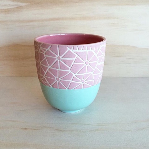
@tinydolldesigns tinydolldesigns@yahoo.com.au
Bunny by http://faithlaine.bigcartel.com & Pastel board by http://www.poppypeach.bigcartel.com
Faith Lane & Poppy and Peach's devine duo bring pastel prettiness to any shelf.
http://www.koabykaitlin.com.au
It's hard to go past a Koa creation and even more so with this pastel pairing.
http://www.mitahlidesigns.com.au
The soft and subtle wooden wonders by Mitahli Designs would be sweet for any wee ones space.
It is easy to see the appeal and charm of pastels & the reason for their longevity.
Ah pastel perfection is purely paradisal and I am proudly passionate. (Apologies, I do love a good bout of alliteration.)
Til next time...
Michelle
Follow me on Instagram @shelladores
Blogspot: www.shelladores.blogspot.com


